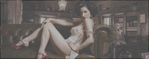
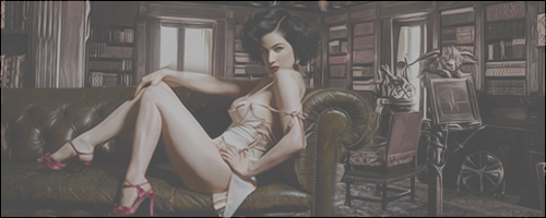
1st banner looks great at first glance, but now that I look at it a bit more closely, it kinda seems like the couch is hovering in the room. I like the look of the first one much better, but the background needs to be shifted up so the couch seems to be sitting on the floor. Other than that, the mix of couch/background looks great.
On the second one, it's obvious you added the chandelier in (or did something to it) because the looks more yellow than the rest of the banner - the rest has a more neutral tone. There's also a loss of detail/fuzziness about the model, indicating you stretched it out to fill in the space.
Overall, you're doing very well


