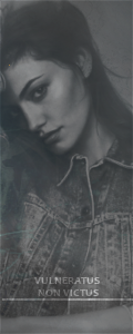
Every wrote:Well, for me it's not because it's lighter colors which is lovely to begin with, but the fact the color palate matches is one thing I like, it kind of flows all together? If that makes sense. He's also well cut out and the placement of the model works with everything that is going on. It's not busy and the text (which is something I always struggle with) is in a good placement.
As explanations go, that's a very good one!
You make a compelling argument that I can't very well deny design wise. It works. I'm just worried it was so out there in terms of my usual style that it came off kinda funny?
Ha ha ha. I make little sense and just babble insecure nonesense!
Thanks for taking the time to explain (I really like it when people talk design with me).